
Teague
Successfully leading the team at Century 21 Central, Adam Teague approached WOW ready to branch out and reposition + rebrand to Teague Real Estate.
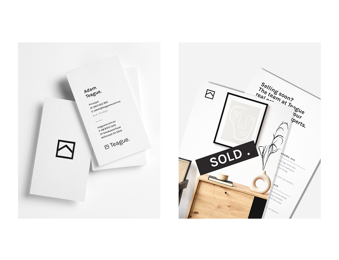
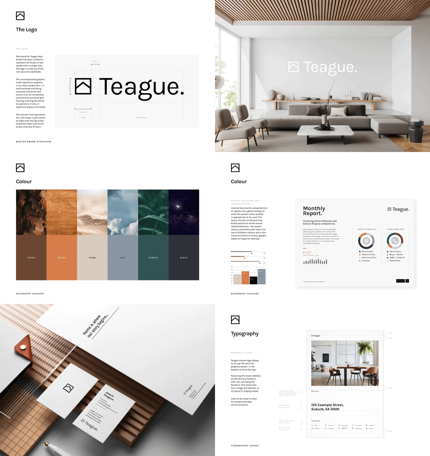
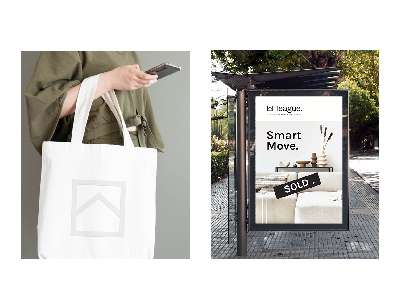
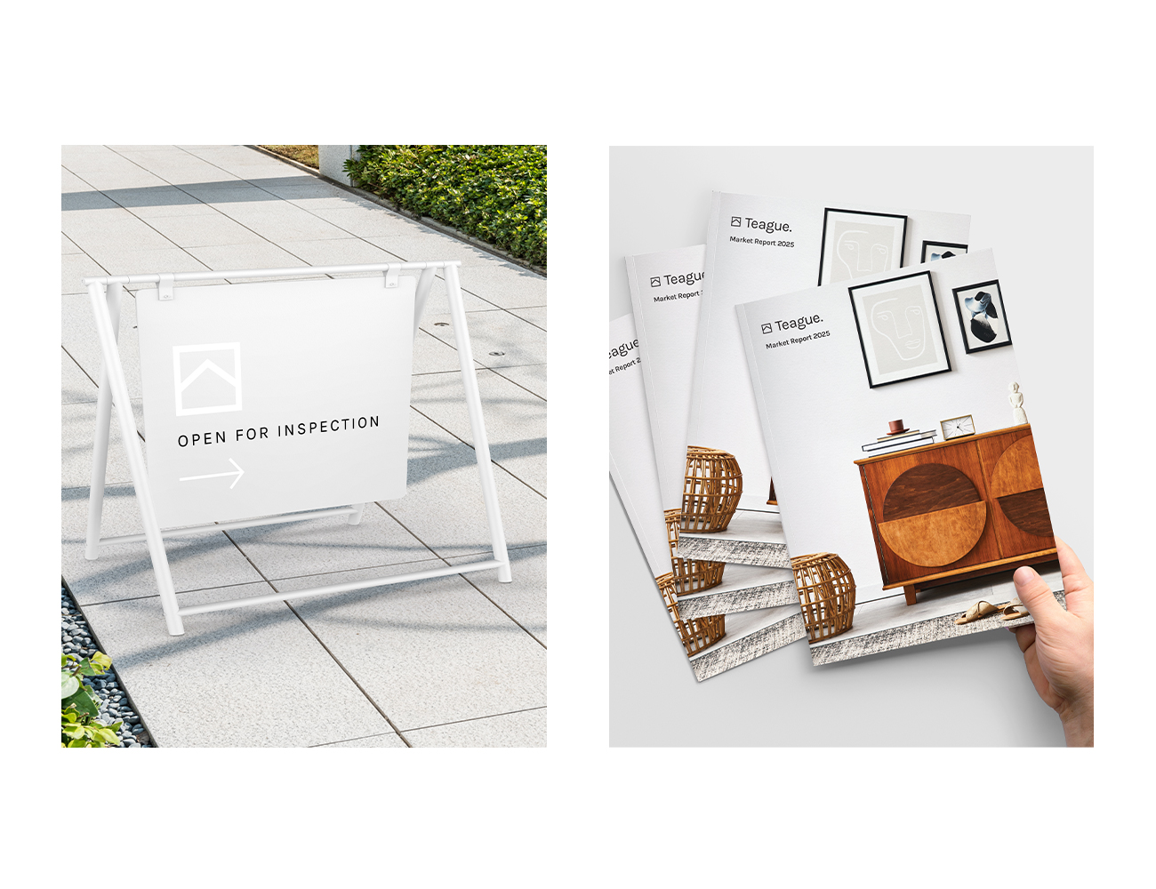
Looking to capture the prestige market, many other brand names were explored but ultimately the Teague name was the obvious choice to articulate the personalised, trustworthy and relationship-first ethos of the agency. The Wow Creative team then crafted a brand mark that represents property in its most simple form – a roof overhead and four walls to feel secure – elements that ring true for residential and commercial, to the buyers and landlords allowing the brand to specialise in one or grow into many.
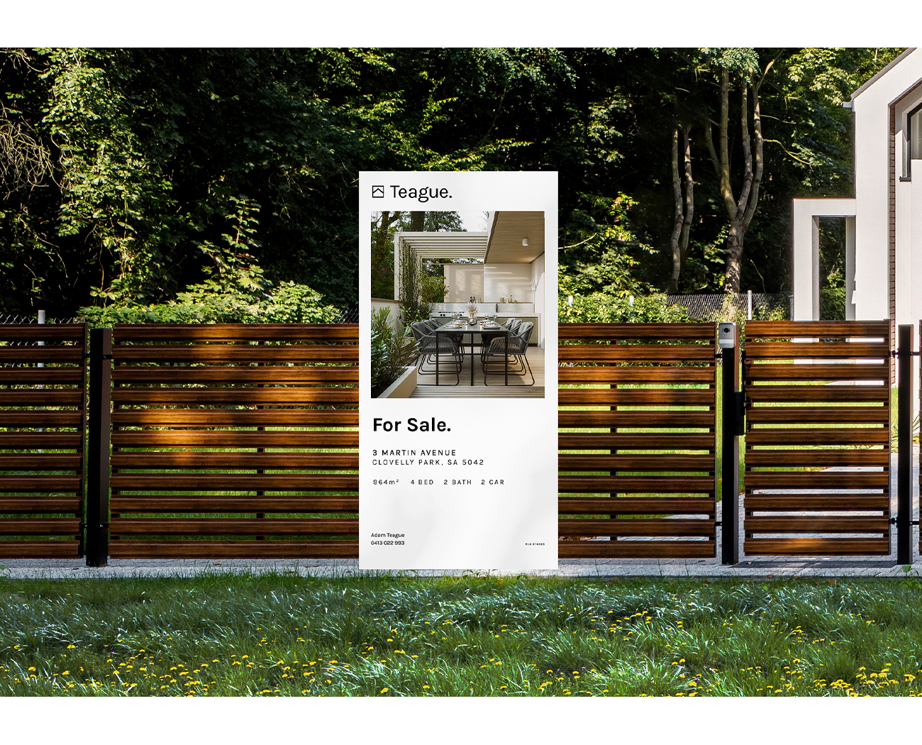
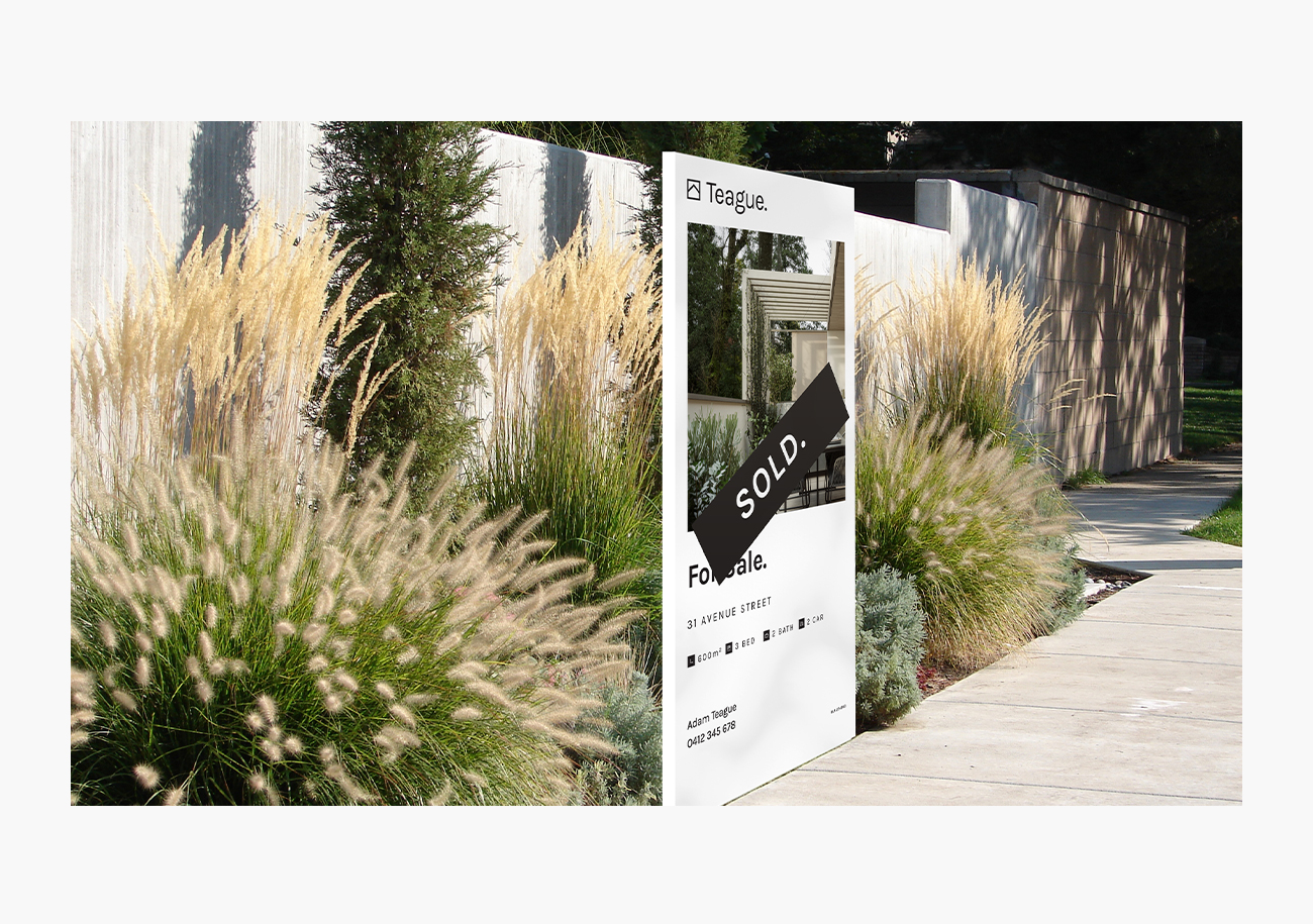
The Teague brand is crisp and uncluttered; the intentionally restrained colour palette reflects the philosophy of Teague Real Estate – to offer a sanctuary in a complex world, providing clarity and peace of mind with a premium level of service.
Taking cues from the Swiss design approach of a minimal, fuss-free aesthetic, a systematic approach to layout with an abundance of negative space gives the Teague brand, and their customers, that essential space to breathe. Not only does this aesthetic give this important sense of calm, it also elevates the brand into the top tier of the property market. With an extensive Brand Style Guide in-hand, the future of this Brand is one to watch.

